Thursday, November 11, 2010

The Moment


This moment is captured during a friend’s birthday party. I was attempting to capture the emotions of the birthday girl and the present-giver during that special moment - the joy of the giver and the surprise of the receiver.


Previous attempts:
I have previously managed to capture some chance photos that kinda suit the theme, like a dog approaching me when called, a tiger in the zoo feeding, a kangaroo scratching its butt etc. However, I realised that all of them are based on animals and that a requirement of the assignment is to show human emotions (not animals'!).

Monday, October 25, 2010

Week 10 - Field Trip to SIPF


Questions

1. In the exhibition, choose a few series of work that inspired you. Explain why.

Fade Away - Kris Vervaeke

I found it interesting that the photographer framed the tombstone photos as if they look like actual portrait photographs. I think that the meaning of people "fading away" with time is created very well here because through the tombstone photos, we know that these people have already passed and the author is trying to say something about "death". The gradual intensifying of the faded-ness of the pictures exude the important concept that after death, people simply just 'disappear' with time.


Home Visits - Alecia Neo

I was inspired by this piece because it wasn't like those random point-and-shoot portraits of people. By stringing the photographs together, it evokes a deeper thinking of the photos and it is then that I got to notice the way the subjects pose for the photos in their homes. All of their living environments are different (through sharing certain similarities) and all their facial expressions are kinds of different. We are able to 'conjure' up a background story for each of those characters and it felt like in a way, we knew them personally.


2. Observe how photographers convey their concept/idea through their chosen media and subject matter. Choose one series of work that you think the photographer has effectively conveyed his/her concept in his/her work.

Physical Realities of Death, A memoir of Toivo Laukkannen by Tristan Cai

The artist used video, actual objects of the deceased and photographs of the late Toiyo Laukkannen as the artistic medium. Photos include pictures from the subject's childhood, youth, adult, old age, all the way till his death (site of his death and autopsy). I think the use of pictures (childhood to old age) and the personal collection of his medals showed that he was a real person and the viewers sort of are able to 'read' through his life in the exhibition. The use of video also complements this as the commentary or eulogy given by family and friend served to help us gain more insight to the person - all these serve to let people know this person at a deeper level rather than just an anonymous someone who had just died. This results in the viewer connecting with artwork emotionally as it felt like 'we know him' and the images of his death brought the notion of his death (or any person's death for that matter) very real to us. The concept would not have been as evident if the artist only used photos of the death and autopsy - it would have just been a cold body without any background story to it.


3. Observe how photographers present their work (i.e. choice of framing, hanging etc.). Choose one or a few series of work that you think the photographer(s) has effectively present his/her/their work.

Museum Anatomy by Chadwick & Spector


I think the piece is interesting because the original artwork (i.e. the painting) is painted on a human body - thus the frame being the body. The photos are blown up to the size of the original painting so it's very clear that artist is trying to make a point/a link with regards to traditional artwork.

The series of photographs definitely does bring about a different feeling towards the original paintings.

Assignment 5 - Appropriation

The term appropriation refers to the use of borrowed elements in the creation of a new work (as in 'the artist uses appropriation') or refers to the new work itself (as in 'this is a piece of appropriation art').

- Wikipedia

Appropriation is a new concept to me as I have never tried to do a photo montage that would eventually have to result in bringing across a certain message. Most of the time, my artwork only consists of leisurely photoshoots and church posters... I had never thought of creating a conceptual piece.

However, I'm glad I'm finally now exposed to this technique as it opens up another way of visual communication. It is in these conceptual pieces that the notion of "a picture speaks a thousand words" becomes more apparent..

So, I'm really very new at this. And here are my iterations:

Presenting first, my favourite piece:

Caption: Pining for family

The idea of this piece is that I wish to invoke a certain sense of outrage in readers regarding the living conditions of the elderly in Singapore. We have a population that is aging, and we have been reading a lot in the papers or hearing from our family/friends that the elderly (who might even be family) are getting abandoned.

This picture shows an image of an elderly couple living physically in an old and abandoned home - an environment not conducive for living, and such is the kind of environments that some elderly folks live in.

To the left of the picture, there is a picture of a happy family - the elderly couple's children and grandchildren. The picture is nicely framed up and looks well taken care of compared to the rest of the house, showing how much they treasure and miss their children.


Some critique from classmates (during e-learning):
  • Generally, my classmates like my piece and the message that I wish to drive across could be grasped by them (so, success! yey!)
  • One feedback, however, was that the image was not provocative enough. I agree that it wasn't as provocative as some of my other classmates', but upon reflection, I realise that what I was trying to do was not to outrightly put the message to the viewer's face. The picture, I believe, gives the viewer a sense of sympathy for the elderly folks first. Then, I was hoping that the viewers would grasp the notion that they themselves are, or could be, the ones who would render that exact pathetic state to their own parents. It should make them realise and question their own sense of filial piety.
  • However, I do agree that some improvements could still be made to the image to make it seem more 'provocative' in the sense that it will encourage the viewers to ponder more about the message. One suggestion would be to find suitable images of elderly folks who 'seem' like they are looking at the family photo (introduce some form of interaction with the photo) to make the notion of "pining for family" more apparent. One difficultly for doing so is, as mentioned by other fellow classmates, the difficulty of finding suitable images online.
Photo credits:
(pic of elderly) http://www.newsobserver.com/2010/03/10/408525/fact-finder-elder-care.html (pic of abandoned house) http://fc02.deviantart.com/fs13/i/2007/080/4/2/Abandoned_House_by_Vonjuntz.jpg (pic of family) http://www.easyaupair.com/viewprofilefamily/18002/


---------------------------------------------------------------


Caption: Real Heroes

Basic explanation for the piece:
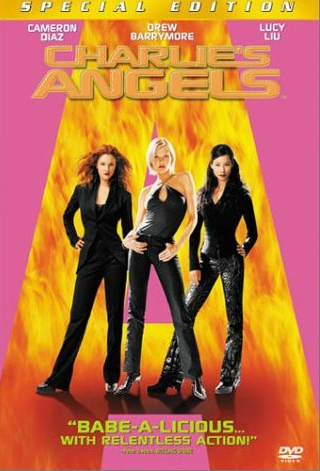
I was trying to get the picture to imitate the style of a Charlie's Angels poster (see below). Many teenage girls look up to such female heroes often portrayed in movies - being sexy, smart, bold and.. perhaps being able to kick butt. However, they do not realise that such idols do not exist in real life. The real heroic spirit, in contrast, comes from women who have made real impacts in the world.

Many of my friends were not able to catch the message, probably because the style of the piece doesn't quite match that of the original movie poster, and also that I only have 2 women in the poster (reason being that I rushed this out last minute and couldn't think of another female hero that everyone knew).


---------------------------------------------------------------


Caption: Classic

Basic Idea:
To show the iPhone achieving a classic status (by borrowing from the style of classic literature books published by Penguin)

Tuesday, October 5, 2010

In Class - Appropriation/Photo Montage

My group's subject: Bathtub.

We did a simple brainstorm and came up with some of these interesting ideas:
- The bathtub as a luxurious item
- Bathtub as evil because it wastes water (therefore the idea was to superimpose a classy image of a bathtub against a barren wasteland)
- Bathtub as just simply evil


So to bring our ideas to 'reality', we headed to 'build' them in Photoshop:


The bathtub is seen as an oasis amidst the dessert. Gives an aura of comfort (hence the glowing effects and the nice beach view).


Thursday, September 23, 2010

Week 5 - Lighting

These are just some of the experiments with lighting that we did in class. My group members were Huang Zhi Long and Wee Hua.


With normal lighting (i.e. just the white ceiling lights above)


I can't really remember what this is, but I think it's most probably taken using spot metering.


Normal lighting again.


And with a reflector. Silver one I believe (placed at the right of the frame -->).


Color cast (green) from a computer screen (placed at right of frame -->).


Bottom lighting
I think it makes the object look powerful and also mysterious.


Top lighting
Short shadows.


Lighting at the back of object, but I think in this case, it should be considered side lighting? Since it's really at the left of my frame.
The lighting effect's quite normal - i.e. not dramatic.


I think this is top-side lighting. A bit of a dramatic effect as we can see from the darker shadows.


Back lighting - achieving a sort of silhouette/glow of the object.


Top lighting - dramatic effect


Side light


Back light - silhouette


----------------------------------------


The class experimenting. =D

Friday, September 10, 2010

High Key

Here are my feeble attempts at high key photography. =X
I might have to reshoot them to get a whiter background. Kinda fun!
Time to invest in a proper white poster-ish or canvas thingy for the background.
I just randomly picked up a Twilight movie poster, turned it over, and used it as the background. Kinda cheapo, but at least the poster's finally put to good use!


I placed a transparency material at the bottom. So that it hopefully brings out more reflection of the wine glass.


Comments from Ms Chiang was that the background can afford to be whiter coz it looks kinda warm-ish here. Ok, will try it soon!

Low Key

These are shots of the outdoors. I don't really know how to take low key shots of objects while having a black background yet (shall ask during class!) so I just tried the outdoors at night. And I think I'm pretty happy with the results!


I was at the railway station and just thought I might try some low key lighting. So I set my camera to spot metering and fast shutter speed. And voila! I think it's quite arty-farty (personally), but I think it's kinda boring as a subject. Haha.


Journey-ed to The Cathay! I think it looks pretty awesome. And I think it'll look even better in black and white.


Colourful lamps outside The Cathay. I wonder if this counts as Low Key - the background is kinda distracting.


Steps of SOTA. I kinda like it.


National Museum. I like how the building was being lit up.
Shot with spot metering and slower shutter speed. I think it was 1/4 of a second.


Another shot of the National Museum.


Boyfriend and I were soon tired so we headed over to Selegie Road for the famous Tao-huay and Youtiao.
I liked how dark the alley was and I thought it'll be a good place for low-key shots.
And tada!
I hope it looks kinda eerie/depressing/dark...